WrapCreator offers you lots of basic graphical widgets that make your web page easier to use and to give it a better appearance. This is the online help page for these widgets.
This is an introduction to the use of widgets in spreadsheets to improve the functionality and appearance of the wrap. If you haven’t used widgets before, you may want to read the Introduction to using widgets before you continue.
Be aware that most of these widgets have no corresponding representation when used in Excel. Some of them are unfortunately totally invisible in Excel. You have to convert the spreadsheet to web format to see the widget in action.
A WrapLink pulls a cell value from another wrap instance. When you click on the value in a WrapLink, it links to the wrap instance that the value was pulled from. This allows the user to quickly traverse a web of complex information just by clicking on the most interesting linked values.
Example: a dashboard cell shows an out-of-range measurement for a railway car bogie. If you click on this cell in the dashboard, you open the bogie detail wrap, with a highlight on the measurement that was shown in the dashboard. You can then return to the dashboard or continue zooming in on the problem.
The WrapLink widget is a visual guide that helps you insert a wraplink() function into the current cell.
Learn more in the help page for the WrapLink widget.
There is also an Introduction to wraps.
The WrapLinkAggregate widget performs mathematical operations over a group of wrap instances that fulfill certain criteria. Some of the more popular functions are SUM, MAX, MIN, AVERAGE and COUNT.
Example: If you use a key that designates a particular depot for rolling stock, you can use the WrapLinkAggregate widget to obtain information such as:
The WrapLinkAggregate widget is a visual guide that helps you insert a wraplinkaggregate() function into the current cell.
Learn more in the help page for the WrapLinkAggregate widget.
There is also an Introduction to wraps.
The WrapLinkList widget pulls cell values from a group of wrap instances that fulfill certain criteria. It is used to populate a dropdown list with all possible valid identities to choose from, e.g. all railway cars in a particular depot with a pending error report.
Example: If you use a key that designates a particular depot for rolling stock, you may retrieve the identities of all the railway cars that belong to this depot and have one or more error reports pending. Prefilling a dropdown widget with these identities makes it easy for the maintenance personnel to quickly select the right railway car. Using a dropdown also eliminates the risk of typing errors in a free-text field.
The WrapLinkList widget is a visual guide that helps you insert a wraplinklist() function into the current cell.
Learn more in the help page for the WrapLinkList widget.
There is also an Introduction to wraps.
ExcelWraps allows visitors to upload documents, images, and other media files with a wrap instance using the Media Upload widget. A separate wraplink called WrapLinkMedia allows you to link to and view the uploaded media content also in other wraps.
Example: A wrap called Inspection has a Media Upload widget in a cell named damages_photos. If you want to show the uploaded images also in another wrap, say InspectionReport, you insert a WrapLinkMedia widget in the report wrap that links to the damages_photos cell in the inspection wrap, selecting the right instance with Unique Keys.
The WrapLinkMedia widget is a visual guide that helps you insert a wraplinkmedia() function into the current cell.
Learn more in the help page for the WrapLinkMedia widget.
There is also an Introduction to wraps.
The WrapSignOff widget replaces conventional paper signatures by allowing authenticated users to approve completed work. It integrates with user roles so that only a person with appropriate authority can sign the wrap. Signatures can lock tabs or freeze the whole wrap instance forever.
Example: A train arrives at the depot for inspection. It has different checklists for mechanical, electrical, and hydraulic components. One worker with each competence signs off the corresponding checklist, thereby locking the checklist from further changes. When all work is complete, a supervisor signs off the entire carriage, which freezes the inspection Wrap instance forever.
The WrapSignOff widget is a visual guide that helps you insert a signoff() function into the current cell.
You can test the status of a signature using the signed() function elsewhere in the wrap.
Learn more in the help page for the WrapSignOff widget.
There is also an Introduction to wraps.
The WorkgroupSelector widget in WrapCreator allows an authorized user in one workgroup to temporarily trust another workgroup to share a wrap instance.
Example: A wrap is used to document an overhaul process. Access is normally only granted to the workgroup that handles the overhaul project. A contractor needs to be brought in to perform some of the work. To simplify the administration of the work to be performed, the wrap instance is temporarily entrusted to the contractor using ExcelWraps. After the work has been completed. the contractor’s trust to access the wrap instance is revoked.
The WorkgroupSlector widget is a visual guide that helps you insert a workgroupselector() function into the current cell.
Learn more in the help page for the WorkgroupSelector widget.
There is also an Introduction to wraps.
The UserSelector widget creates a dropdown list with user names that have certain combinations of roles. Only one of the eligible users can be selected.
The dropdown list created by the UserSelector widget is populated with the names of all the users that have all the roles in at least one of the combinations you have specified.
Example: A Wrap instance for bogie overhaul must reference the Supervisor responsible for the overhaul. A UserSelector widget automatically prefills a dropdown list with the names of all users that have the Supervisor role. The Supervisor just needs to select his/her own name in the list.
The UserSelector widget is a visual guide that helps you insert a userselector() function into the current cell.
Learn more in the help page for the UserSelector widget.
There is also an Introduction to wraps.
The CInput widget allows you to lock a wrap field for user input unless certain conditions are met. You evaluate these conditions in a separate “enabling” cell which must return TRUE to open the locked field for input. The currently logged-in user must also have a designated role.
The CInput widget ensures that the currently logged in user has a qualifying user role and that an enabling cell returns TRUE. If so, the field is open for input. Otherwise, the cell remains locked and cannot be modified.
Example: A signature has an associated comment field. A comment can only be entered when the Wrap instance is ready to be signed, and only by a person qualified also to sign the Wrap instance.
The CInput widget is a visual guide that helps you insert a cinput() function into the current cell.
Learn more in the help page for the CInput widget.
There is also an Introduction to wraps.
Holder widgets are mainly used to return miscellaneous information from the server. Timestamps, user names or user counts can be stored in hidden fields in the wrap. If problems occur, holder widgets may provide valuable debugging information.
The Holder widget is mainly for “internal use only”. It enables the developer to save information in the wrap that may become useful if a problem occurs.
Example: Signatures made on instances of a previous version of a Wrap may have been signed with possibly different calculated values or the appearance of the Wrap may have changed. You can use simple logic for the signature enabling cell that ensures that both old instances and new instances always satisfy the appropriate cell enabling logic. The easiest way to do this is to use a Holder widget containing the creation date for the Wrap instance. In the enabling cell, you can then use an =if() statement to use different enabling logic based on the creation date for the Wrap instance.
Learn more in the help page for the Holder widget.
There is also an Introduction to wraps.
The WrapStack widget allows advanced users to perform bulk operations on wrap instances. Users can insert new instances, update existing instances, or add fields to a wrap. This can save considerable time when many new instances need to be created regularly, e.g. for daily inspection, or when the same change needs to be done to many or all wrap instances.
Example: At the beginning of a day, it is known what trains will arrive at a depot for inspection. A WrapStack job is used to create a new instance of a daily inspection checklist for each carriage in each train that arrives at the depot. The correct checklist is used for each type of carriage in the train.
The WrapStack widget is a visual guide that helps you insert a wrapstack() function into the current cell.
Learn more in the help page for the WrapStack widget.
There is also an Introduction to wraps.
Text fields are mainly used in electronic forms to mark the fields where the user will enter data that is not used in calculations, e.g. a name or an address. You insert a Text field widget by clicking the Text widget in the Widgets tab in the task pane.

You can set different properties for the Text field:
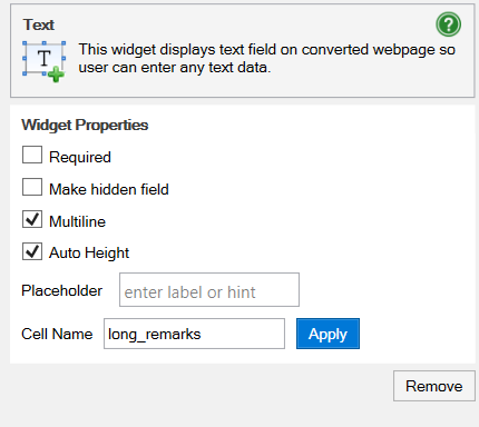
Cells can be made read-only using a setting for the Text and Utility widgets. Read-only cells are editable until the wrap is saved for the first time.
We recommend that you use the read-only attribute only for input cells. If an output cell – e.g. returning the result of a formula – is made read-only by a Utility widget, and the formula returns a different result than it did for the first save, the new value violates the read-only setting and the wrap can no longer be saved.
Consider making read-only cells Required, if they are.
If a read-only cell is always assigned a value automatically, e.g. from the query string in the link, you may want to consider making it Hidden.
One of the most common and also most complex data validations is to verify that e-mail addresses are correctly written, e.g. that there is only one @ sign, that there is text on both sides of each period etc. The syntax rules for an e-mail address are far too complex to be handled with Excel Data Validation or Excel formulas.
Instead, use the E-mail widget which is a standard text field with built-in validation of e-mail addresses. The field must either be empty or contain a valid e-mail address. If the e-mail address has an incorrect syntax, or if the field is empty but set as Required, the field is considered in error and the form cannot be submitted. This reduces the risk that you receive forms with missing or incorrect e-mail addresses.
The widget only validates the character string in the field; there is no live or online validation that the provided e-mail address actually exists or that someone reads the e-mails sent to it.

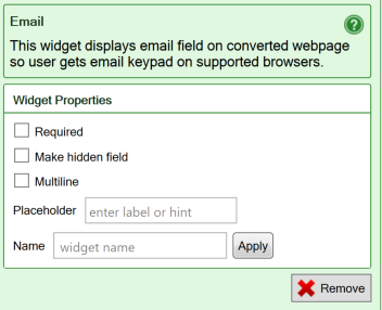
The properties for the Email widget are the same as for the Text field:
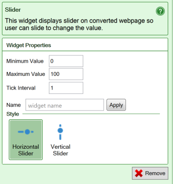
A Slider allows the user to select a value by moving a handle to a particular position on the widget. Sliders are real-time and cause the entire spreadsheet to be continuously recalculated with each new value of the slider as you move it.
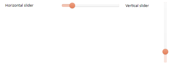
You insert a Slider widget by clicking the Horizontal Slider widget (value increases from left to right) or Vertical Slider widget (value increases from bottom to top) in the Widgets tab in the task pane.
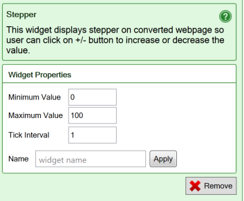
The Stepper widget allows you to easily input small numeric values with just a tap or click on a button.
The worksheet is re-evaluated for each new value, making this a very useful widget when the user is trying to find an optimum value.

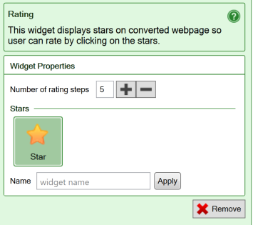
Ratings widgets are used to rate, or grade, an experience or a product with symbols like stars. It’s an effective way of expressing one’s opinion about something.

You insert a Ratings widget by clicking the Ratings widget in the Widgets tab in the task pane.
Calendar widgets make it much easier for the user to pick the right date. It also makes it easier to count from one date to another. The widgets ensure that any date picked from the calendar is valid, and formats it correctly for the recipient of the electronic web form using the regional settings.
Save all relevant image links in your spreadsheet or create formulas that can build the right image link dynamically from user input.
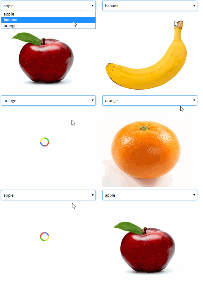
Use the Link Image widget to select the image that is shown.
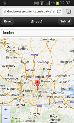
The Google Map widget allows you to use interactive maps in the converted web page.
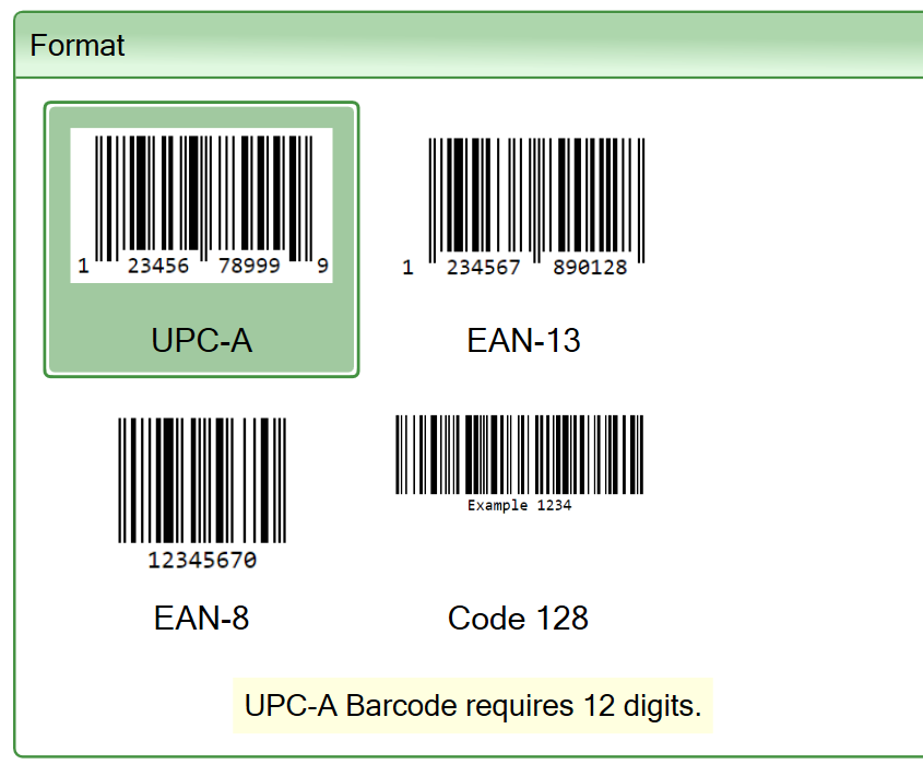
Use the barcode widget to display a barcode from static or calculated content in your web form.
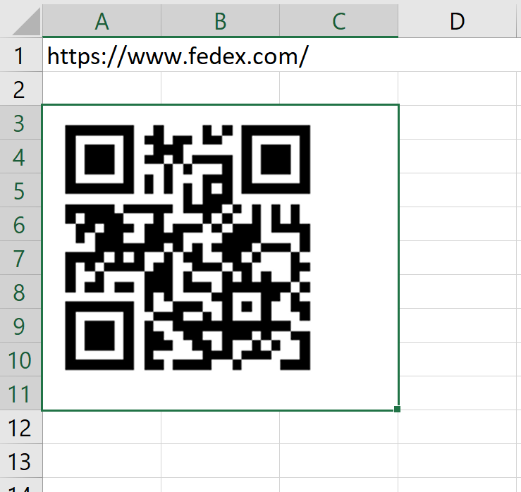
You can display QR codes directly in the web page using the QR code widget.
A wrap instance can have file attachments. The Media Upload widget allows your users to upload documents, images or streaming media into a wrap instance.
The Media Upload widget makes it possible to use wraps in document management solutions. Users can attach scanned or digital documents, photos, videos and any other files they want to store with the wrap instance.
Example: A Wrap is used to report problems with railway carriages. The Wrap contains a Media Upload widget that allows users to attach photos to each error report.
The Media Upload widget is a visual guide that helps you insert a wrapupload() function into the current cell.
Learn more in the help page for the Media Upload widget.
There is also an Introduction to wraps.
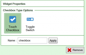
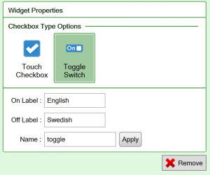
Use check boxes only for statements that must be either true or false, there is no room for doubt, like “British citizen”. The Toggle switch allows you to use any two other names for True and False, e.g. a language pair.

You insert a Check box widget by clicking the Check box widget in the Widgets tab in the task pane. A Check box will provide a true/false value that you can test for in other places in the form, or when the form is submitted for processing.
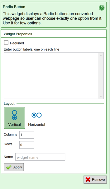
Radio buttons simulate the behavior of old car radios. When one of the buttons is pressed, the corresponding radio station (option) is selected. Simultaneously, all the other buttons pop out, leaving only the selected button in the pushed-in position.

Radio buttons are used to select between a limited number of choices. The good thing about radio buttons is that you see all the available choices. The bad thing is that this may consume a lot of screen space. You insert a Radio buttons widget by clicking the Radio Button widget in the Widgets tab in the task pane. You can then set different properties for the Radio button widget:
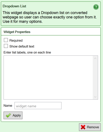
Drop-down lists are used to select between a limited number of choices. The menu opens when you click on it. When you have made your choice, only the selected choice is visible.

You insert a Dropdown list widget by clicking the Dropdown List widget in the Widgets tab in the task pane. List the labels in each line in the empty space. You can then set different properties for the Dropdown List:
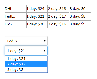
If you want the options in a dropdown menu taken from cells in the spreadsheet, learn more about the Dynamic Dropdown widget.
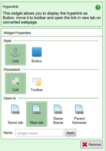
The Hyperlink widget allows you to easily insert links into the converted web page, either as text links or as buttons.

Any cell in your worksheet can contain a web address in the form of a Universal Resource Locator or URL:

Unfortunately, Excel considers this to be just plain text. Nothing will happen if you click on this cell. If you convert this spreadsheet to a web page, the URL is generated as plain text there too, and clicking on it will have no effect.
To turn a URL into a working link, you have to insert a hyperlink into the cell. Excel can optionally create a hyperlink automatically every time you enter a URL into a cell, and then the link itself is used also as the anchor text for the link. To use any anchor text you like in the link, you can use the Insert Hyperlink command:
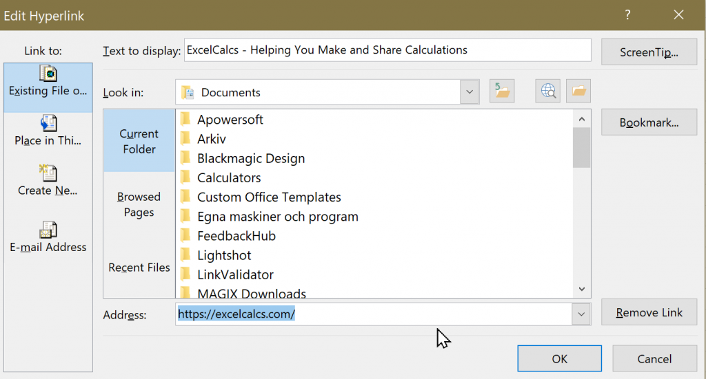
Notice that the anchor text, in the Text to display field, can be different from the link’s Address, when you use the Insert Hyperlink dialog to create the link. Users easily detect when a cell contains a hyperlink, because of its classic formatting in blue with an underline:

By default, WrapCreator preserves hyperlinks on the converted web page. The anchor text will be displayed and linked to the requested URL.
With Excel, a link can also be calculated with the
=HYPERLINK(Address, Text to display)
function. In this case, the Address portion of the link is assembled dynamically according to the formula you have specified. The URL may be determined conditionally using the IF function or the address assembled from other cells. The Address to use in a given situation can even be selected with the VLOOKUP function from a list of links. The Text to display operand of the Hyperlink function allows you to define the anchor text for the link.
=HYPERLINK("https://excelcalcs.com/","ExcelCalcs - Helping You Make and Share Calculations")
The Hyperlink widget provides a few additional useful features:
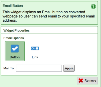
An E-mail Button converts to a mailto (“send an e-mail to this e-mail address”) hyperlink. When the button is pressed, the default e-mail client normally opens a new, empty e-mail with the provided e-mail address as the e-mail recipient. The user enters the Subject and Text for the e-mail, then clicks Send to send the e-mail.
Note that none of this functionality is provided by WrapCreator. It is up to the user’s web browser to handle mailto links. If the user’s web browser is not properly configured to handle mailto links, the results are unpredictable.

The contents of your wrap will not be involved in the processing started by the E-mail Button widget.
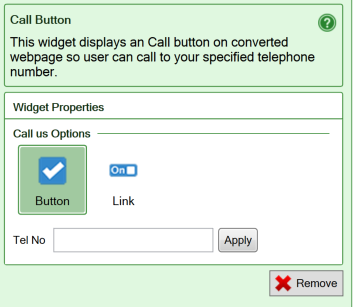
A Call Button converts to a tel (“initiate a telephone call to this number”) hyperlink. When the button is pressed, the device will initiate its normal behavior for tel hyperlinks, which usually is to make a telephone call to the number you have specified.
Note that none of this functionality is provided by WrapCreator. It is up to the user’s web browser to handle tel links. If the user’s web browser is not properly configured to handle tel links, the results are unpredictable.

The contents of your wrap do not participate in the processing started by the Call Button widget, and nothing is sent to the designated telephone number.
When you view a Wrap instance, you can save content from it as a spreadsheet in xlsx format using the Export to Excel widget. You select whether to export data from all sections of the instance or just the current section. You can place Export to Excel action buttons anywhere in the Wrap. The text on the buttons can be changed. Just type the text you want on the button into the cell where you place the widget.
The instance export file captures the users’ input values while retaining as much as possible of the layout and formatting of the original spreadsheet. You can export the complete original spreadsheet for the Wrap on the Wrap instances page.
The filename of the exported spreadsheet is made up by the name of the Wrap and the unique keys for the exported instance:
{wrapname}+{key-value}+{key-value}_Export.xlsx
with one key-value pair for each component of the unique key for the exported instance.
Example:
BogieOverhaul+Unit-395001+Car-395678_Export.xlsx
If the instance hasn’t been created yet, the unique keys are omitted.
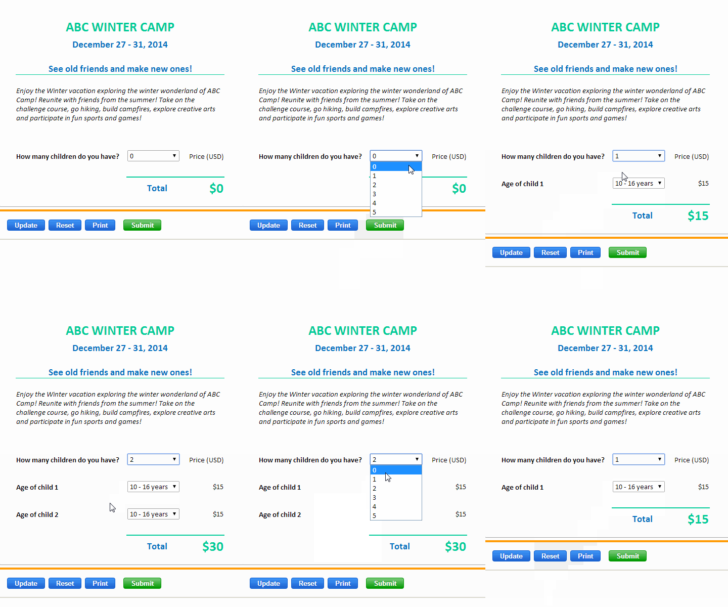
You can hide certain rows in your spreadsheet, and even entire worksheets, depending on the contents of a controlling cell.
Responsive blocks allow you to dynamically adapt the layout of the converted web page to the screen width of any device.

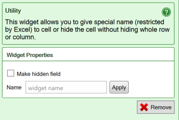
The Utility widget can be used to assign a name to a calculated cell, or to make it invisible.
You insert a Utility widget by clicking the Utility widget in the Widgets tab in the task pane. Utility cells in a form or calculator are always locked for user input in order to preserve the contents.
