In this Help page, we will show you how to split a spreadsheet into responsive blocks that wrap nicely on all screens.
If you are new to responsive design, you may first want to read the introduction to responsive design.
Before you create your first responsive spreadsheet, we suggest you read our best practices for responsive blocks to avoid the most common mistakes.
This part of the tutorial shows you how to define the responsive blocks in your spreadsheet.
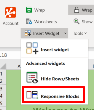
Open the Responsive blocks settings from the ribbon.
Click on the Add new button.
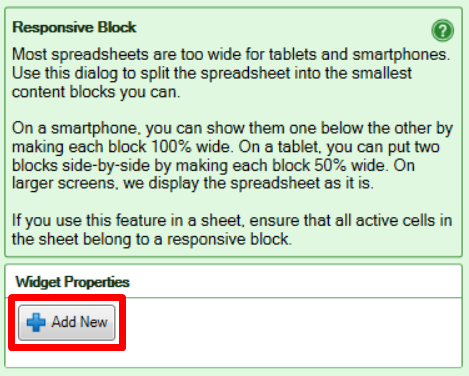
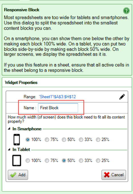
This opens the widget properties panel, in which you select the cell range for the first block. Click on Select Range.
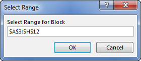
When the Select Range box appears, place the cursor in the input field and type the coordinates for the block or drag the cursor diagonally across the cell range.
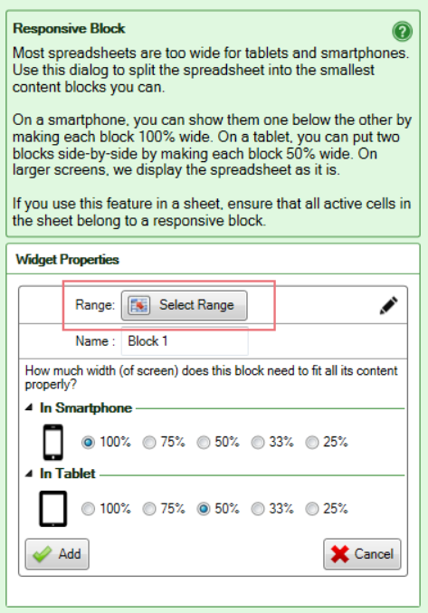
Give the block a name that makes it easy to understand its function in the spreadsheet, and its contents.
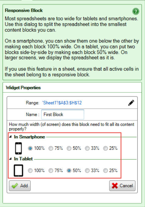
Specify how much of the screen width to use for the block. There are separate settings for phones and tablets.
In the below screenshot, the block will use 100% of a phone screen but only 50% on a tablet. This gives room for additional blocks to the right if they use 50% or less of the screen width.
This part of the tutorial shows you a preview of how the screen will be used on a phone and tablet.
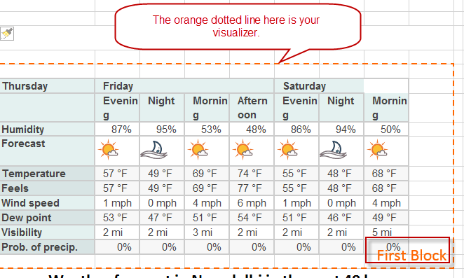
Click the Add button. An orange dotted line appears in your spreadsheet to visualize the responsive block. At the bottom of the visualizer, you see the name of the block. Please do not directly edit the visualizer graphic.
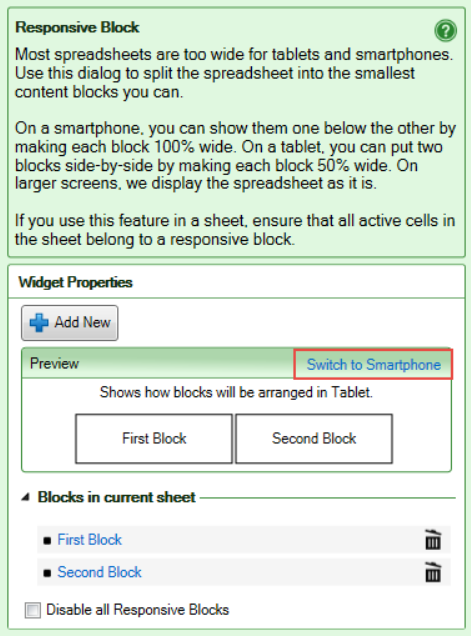
The Preview section shows you how the blocks you have created will appear on phone screens. Since the width was set to 100%, each block fills the screen so only one block at a time is shown.
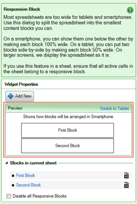
If you want to see how your blocks will fill a tablet screen, press Switch to Tablet. Since each block only requires 50% of the screen, they now fit beside each other.
Continue defining responsive blocks until all active cells in the spreadsheet belong to a responsive block.
Press Convert in the ribbon to convert the spreadsheet to a Wrap.
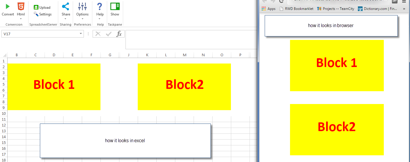
You don’t need a tablet or smartphone to verify your responsive design. The layout is responsive already on your laptop and will automatically adapt to any change to the width of your browser window. Just make the browser window more narrow and you will see how the responsive blocks automatically reposition themselves for the new window width.
To verify the results in your phone or tablet, use Instant Testing.
Learn how to edit or delete responsive blocks
Before you create your first responsive spreadsheet, we suggest you read our best practices for responsive blocks to avoid the most common mistakes.