This page contains tips and tricks to help you become successful with responsive blocks. We hope this collection of best practices will help you create the best possible responsive designs for your wrap.
Before you separate a spreadsheet into responsive blocks you may want to prepare it a bit for the new challenge.
With responsive design, one or more responsive blocks will be placed side by side on the screen until the whole width of the screen has been utilized. The first block that doesn’t fit at the end of the current row of blocks will instead appear first in a new row of blocks.
Already from the start, the screen of your mobile device is probably less wide than that of your office computer. To make matters worse, many mobile devices are most conveniently used in their portrait orientation, i.e. with the shortest side up, while most office computers typically operate in landscape orientation with the longest side of the screen at the top.
When you design spreadsheets for portrait-mode devices, you may have to rethink the entire design of the sheet. Try to divide the contents of the spreadsheet into rectangular areas with portrait orientation. The contents of each block should be as independent as possible of other things in the spreadsheet since each block may fill the entire screen on smaller devices. To see anything outside the currently visible block, the user will have to scroll up or down.
On the other hand, if you try to show too many spreadsheet columns at the same time on a small screen in portrait mode, they will become zoomed out and difficult to read. Try to make your blocks contain as few spreadsheet columns as possible.
Don’t create horizontal information structures in your spreadsheet if you can avoid it.
Do repeat the row headings for every data column to increase the readability on narrow screens where only one data column may be shown at a time.
Keep in mind that responsive blocks are rectangular cell areas that cannot overlap.
Don’t include any cell in the spreadsheet in more than one responsive block.
Do move things about in the spreadsheet if necessary to create non-overlapping rectangular areas.
Regardless of the screen width, responsive blocks always appear on the screen in the same sequence as in the original spreadsheet when reading from left to right, going down.
Before you define the responsive blocks for a spreadsheet you may want to redesign it so that the order of the blocks will be natural also for users of mobile devices that view the calculator’s responsive blocks in a rearranged form.
Don’t use arrows to point to things in the spreadsheet. With responsive blocks, the section you thought would be to the right may instead appear below the current.
Do put the most important or summary information in the left-most, upper-most responsive blocks, so that it appears first on all devices.
Some responsive blocks contain more spreadsheet rows than other blocks, making them longer. When two or more blocks appear side-by-side, it often looks best if the left-hand block is the longest. Having a lot of white-space in the left part of the screen can look strange in countries where people read from left to right.
Don’t assume that the blocks will relate to each other the same way on small screens as they do on your office computer.
Do test your spreadsheet on both phones and tablets to see how white-space appears as you scroll through the worksheet.
One of the main purposes of responsive design is to avoid horizontal scrolling. For tabular data, this can be impossible to achieve. Let’s say you have a table of financial data per month. We currently do not offer a way to automatically decompose such a table into responsive blocks without losing the row headings as you scroll to the right.
Don’t create a single responsive block for a large table. Narrow screens will zoom out for all columns to fit, and the text will be impossible to read.
Do move every complex table to a separate worksheet, without defining any responsive blocks for it. In this case, responsive design will not be enabled for the worksheet. Users can scroll horizontally to see the entire table.
Charts are special objects and making them responsive requires special attention. Try to use a separate responsive block for each chart so it does not mix with other charts or texts.
Don’t
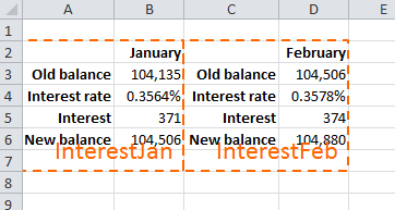
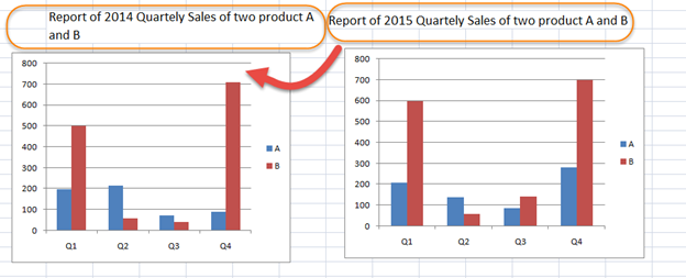
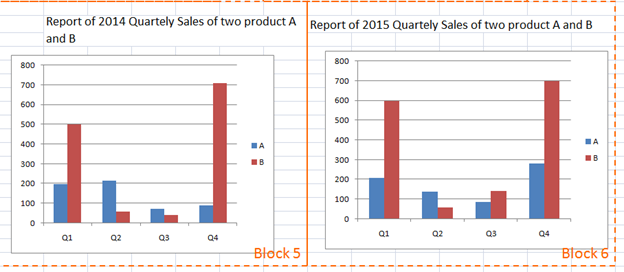
If you have a heading on the top of a chart or data column, put it inside the same block as the chart or data. Otherwise, the heading may be separated from the chart or data.
Don’t
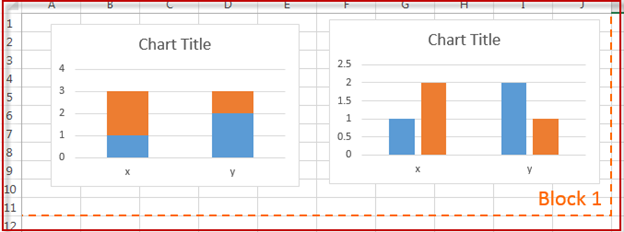
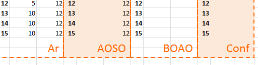
If you separate the heading of each chart into 2 blocks, then the heading of the second chart will move below the heading of the first chart.
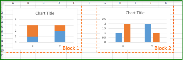
Do
Define the blocks like this instead:
When you use graphical items like charts, maps and some of the widgets, it is easy to just drag the placeholder to the right spot on the sheet. In many cases, the resulting web page will look fine anyway. This is thanks to Excel’s graphical layers, that allow you to position stuff freely on top of a spreadsheet.
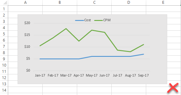
Don’t just float the chart on top of the worksheet. As you can see in the screenshot below, the chart is not properly enclosed in a single cell.
With responsive design, it may be difficult to place a chart or map in exactly the right position on the web page just based on where you put the placeholder in the graphical layer. To ensure a correct result with responsive design, always place charts, maps and graphical widgets in their own cell.
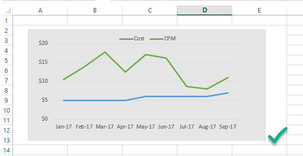
Do merge cells to make room for each chart or map. In the screenshot below, the cells A2:E13 have been merged to become a much more reliable home for the chart.
Border lines between columns in spreadsheets may look like they are shared by the two columns, but they aren’t. Column A may have a right border or columns B may have a left border. To you it looks the same but to Excel it’s two different things.
When you define responsive blocks with border lines along the edges of the block, Excel may consider the borders part of another responsive block than you do, and so the blocks appear for the wrong responsive block.
Don’t use border lines at the boundaries of responsive blocks.
Do use other visual signals like background colors to visually separate blocks from each other.
In a responsive worksheet, all active cells must belong to a responsive block.
Don’t forget any active cells when you define the responsive blocks.
Do accept that some worksheets just cannot be made responsive. For some sheets, horizontal scrolling is the only way to go.
We don’t like restrictions but we do have a few. You may be tempted to create a responsive block that contains only one cell. This is usually a large merged cell that you thought you could use as a separate Responsive block. And here comes the restriction: you can’t. It causes Excel to lose the column width.
Don’t create a responsive block that contains only one cell.
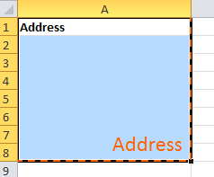
Do include some extra cells in every responsive block that contains a single cell. Just add a cell above with a text heading and it will work fine.
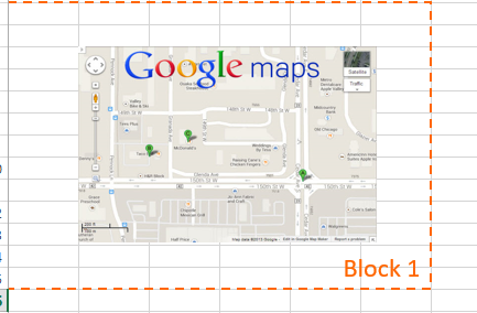
Add an extra column to the left- and right-hand side of every Google map. If you don’t, mobile users may become unable to scroll through the Wrap – they will re-center the map instead.
Don’t let maps fill the whole screen. The map will just follow the users’ finger movements on the screen to a new location, and users can no longer scroll through the Wrap.
Do use margins also for responsive blocks that only contain a map or an image. The margins provide a space for users to drag their fingers when scrolling.
Read our comprehensive design guide to learn how to design web calculators for a global, mobile audience: