When you convert a spreadsheet to a wrap, the formatting is mainly copied from Excel. If your spreadsheet looks good, so will your Wrap.
One of the many strengths of the spreadsheet concept is the easy handling of rows and columns. When creating a spreadsheet in Excel you can tailor the exact appearance of each row and column, including
Most of these settings are retained when you convert the spreadsheet to a Wrap. There are also numerous ways to format individual cells, including
Once again we will do our best to have the converted Wrap look like the original spreadsheet. If you find that the output of a conversion doesn’t exactly match your intentions, you may first want to go back to the Excel spreadsheet, adjust the formatting and convert the spreadsheet again until it is perfect.
When you create a new spreadsheet with Excel, a large number of default settings are applied. Some of these may be obvious, others may depend on the situation, and a few are downright peculiar, in particular in a web environment.
Excel uses the regional settings in Windows to determine things like
The converted Wrap will automatically format dates, times, currency amounts and numeric values according to the regional settings that were in effect during the conversion. If you wish to create a Wrap for a different country or region, or for a global audience, you may want to change the regional settings in Windows before you perform the conversion.
If a cell is too small for its contents, Excel will truncate or wrap text. For numbers, however, you will get a warning if the contents don’t fit the cell – the entire cell is filled with number signs: #######. This is to avoid showing a partial number that may be misinterpreted as being the complete number.
Before converting a spreadsheet to a web page, ensure that all numeric fields are wide enough to contain all possible values.
By default, Excel has a rather peculiar habit of aligning rows at the bottom. If you insert a Calendar widget you may get the following result:
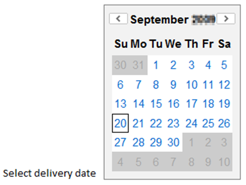
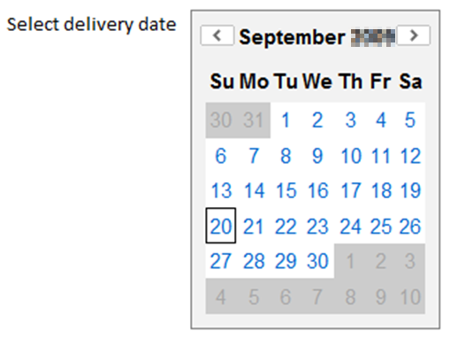
This is because by default, Excel will align the cells at the bottom. Change the vertical alignment from Bottom to Top to make your spreadsheet easier to read:
A spreadsheet usually has a lot of content that cannot be changed when the spreadsheet is used:
There is also often suggested content that can be changed when required.
WrapCreator supports all this. Any static content you provide in the spreadsheet will also be present in the converted web page.
One major difference between the spreadsheet and the Wrap is the locking of the cells. In a spreadsheet, all cells are typically unlocked, which allows you to type a static value into a cell that has a formula. In the web page, all cells are locked by default. Opening cells for input requires special consideration.
Widgets use the same row/column layout as the rest of the spreadsheet. Many widgets require more space than the default row height and column width in Excel.
As an example, if you use a dropdown list, a listbox or radio buttons to select a city or state name from a list, you probably want the widget to be wide enough for the longest name in the list. If you don’t, WrapCreator must either wrap the longer names over more than one line or truncate the names after the allotted width. Neither option really looks good.
If a widget is too big to fit within its cell’s height and width, the corresponding row and/or column may be widened automatically, depending on the web browser. This will probably harm the layout of your spreadsheet in an unpredictable way.
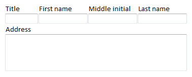
To make it easier for widgets to fit your spreadsheet, you should merge horizontally adjacent cells into one, giving the widget more space. In the example below, sixteen cells have been merged for the multi-line Address field.
You can merge cells exactly the way you want using Excel’s own Format Cells command.
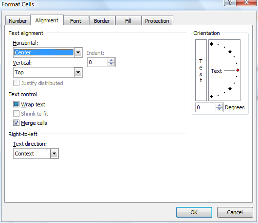
Image widgets like Link Image, Google Map or barcode are represented in Excel using an empty placeholder. The placeholder cannot show the correct image in Excel, but it allows you to position the image correctly within the form and give it the correct size. When you convert the spreadsheet to a Wrap, the widget replaces the placeholder with the actual image it is supposed to show, e.g. the image, map or barcode.
Before you insert any kind of image widget we always recommend that you merge the cells behind the image placeholder. As you can see in the screenshot below, we merged cells A19:B23 to create a small container for the placeholder. In most cases it works fine anyway but merging the cells makes it much more obvious to both you and WrapCreator where the image is supposed to go.
To insert an image widget, select the cell where you want the upper left-hand corner of the placeholder to appear. Make the task pane visible. Locate the Widgets tab and click on the appropriate widget icon to insert the placeholder into the selected cell.
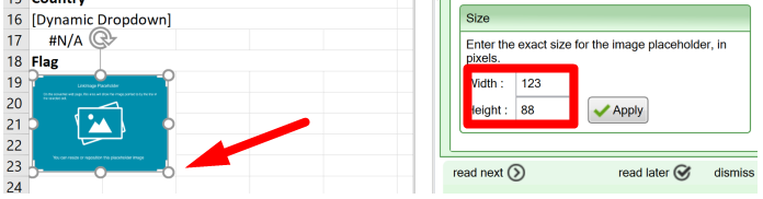
You can drag the placeholder to the best position, and change the size of the widget’s image as it appears on the web page by dragging the placeholder’s handles. In our case, we made the placeholder the same size as the merged cell area behind it. To adjust the width and height to an exact size in pixels, enter your numbers in the corresponding widget settings and click Apply (the widget settings look slightly different for each type of image widget, but you get the picture).
Read our comprehensive design guide to learn how to design web calculators for a global, mobile audience:
A column in Excel that has a width of 26 will occupy about half the screen width of most smartphones in portrait mode. As a rule of thumb, you can multiply the width of a column in Excel with 7 to get the resulting column width on the screen, expressed in CSS pixels.
That last part probably didn’t mean anything to you. And yet it’s a very useful thing to know if you wish to design a spreadsheet to exactly match a given screen width without zooming. Still curious? Let’s take it from the start.
The screen of a laptop, tablet or phone consists of pixels, the small physical points that together form the raster image on the screen. The density of these pixels directly affects the image resolution – the more pixels per inch, the better the image quality. Changing the physical pixel density usually does not affect the size of the objects on the screen. A phone with twice the pixel density still shows the objects in the same size, otherwise many things on the screen would become too small to see or touch.
This is because web designers can express how big an object is to be on the screen, regardless of the physical pixel density. This is called logical pixels or CSS pixels. As an example, many phones have a CSS pixel width of 360 in portrait mode. This means that an object with a width of 180 CSS pixels would fill half the screen width on all these devices. It would look better on phones with a higher pixel density, but it would be the same size.
In the table at https://www.mydevice.io/#compare-devices you can see the screen width in CSS pixels for many current handheld devices.
And now we’re back at where we started. The width of a column on the web page, in CSS pixels, is approximately 7 times the width of the same column in Excel. So if you want a column to fill half the screen width of a common phone in portrait mode, you should start testing with a column width of 26 in Excel. This is because the width of the phone’s screen probably is around 360 CSS pixels, and half of that is 180, and divided by seven is 26. Or put the other way: a column in Excel that is 26 wide will become approximately 7 * 26 or about 180 CSS pixels wide on the phone’s screen, which is half the width of the most common phone screens in portrait mode.
When your spreadsheet is converted into web format, you will lose most of the detailed control of the user experience you had when you designed it in Excel. As an example, most web browsers remove spaces as they see fit. If you position text by inserting extra spaces before or after a word, you will find that even though SpreadsheetConverter maintains the extra spaces in the converted web page, the browser simply discards them, which may give a totally different layout to the page.
Once converted into web format, spreadsheets also enter the realm of competing and sometimes incompatible web browsers. No browser is identical to the other, and a web page will inherently appear somewhat different in each browser and device. This is part of the natural behavior of the world-wide web.
When WrapCreator converts a spreadsheet for the web, it is forced to make certain compromises when it comes to formatting. When compared to the original spreadsheet in Excel, the web page created by WrapCreator will not be an identical twin regardless of which browser or device you use to view it. In fact, it will look slightly different in every browser, and often different between versions of the same browser. Once again, this is a natural consequence of entering the web environment. In most cases, the result is good enough. Just remember to test your web page in as many browsers and devices as you can.