This help page describes how you can use MyWraps to generate powerful charts that visualize complex data series and their relationships.
When a MyWraps report contains the information the user wants, it can be visualized also in the form of one or more charts. Users move back and forth between the tabular view and the chart view by pressing the View button in the MyWraps toolbar.
Charts have interactive pinch-zoom controls and each data point is clickable to open the Wrap data source.
Using charts helps you detect anomalies and see trends. Charts also make it easier to discuss complicated issues in a group.
This help page describes the MyWraps chart generator and how you can tailor MyWraps charts to your own needs.
Administrators predefine the chart view using the Chart button in the MyWraps toolbar.
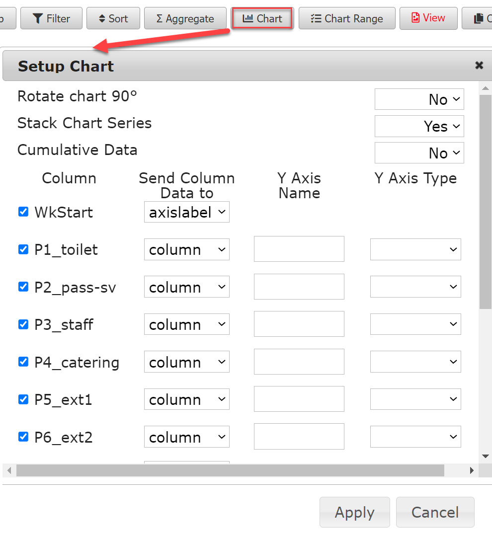
Rotate chart 90° – The chart is rotated 90 degrees clockwise, making the x-axis appear on the left side of the chart. A rotated column chart is called a bar chart, with the bars extending horizontally to the right. Bar charts may be easier to comprehend than column charts when the values are durations.
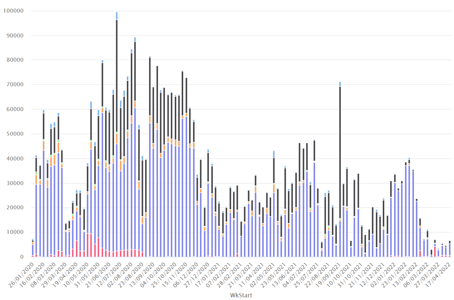
Stack Chart Series – In a stacked chart, the values from the second and subsequent data series are added on top of the existing column, making it easier to compare the total value while still giving a rough breakdown of the components. The column chart above is a stacked chart, and the length of each column is the sum of the values from all the data series. The length of each stacked column shows the total value for each period.
Cumulative Data – If the chart shows data that is added to a final cost, time consumption, etc, you can have the chart automatically show the increasing sum instead of each individual value. If a data series contains 1, 2, and 4, and Cumulative data is selected, the chart shows the values 1, 3, and 7.
Each cell in the wrap template that is included in the report will appear as a separate data series. You can change the order of the data series or “columns”, just click and hold on a column name and drag the column up or down in the list.
Checkbox – tick the box if you want this data series included in the chart.
Column – the name of the cell in the wrap template that contains the data for this series.
Send Column Data to – Defines how you want to use this series in the chart. Read more below.
Y Axis Name – Explains what the values in the data series represent and appears along the Y Axis. If the chart is not rotated, the Y-axis appears to the left in the chart.
Y Axis Type – Select datetime if your values contain both date and time. Select date if your values only consist of a date. Select none for all other values.
For each data series, you need to specify how you want the chart generator to use it. These are your choices:
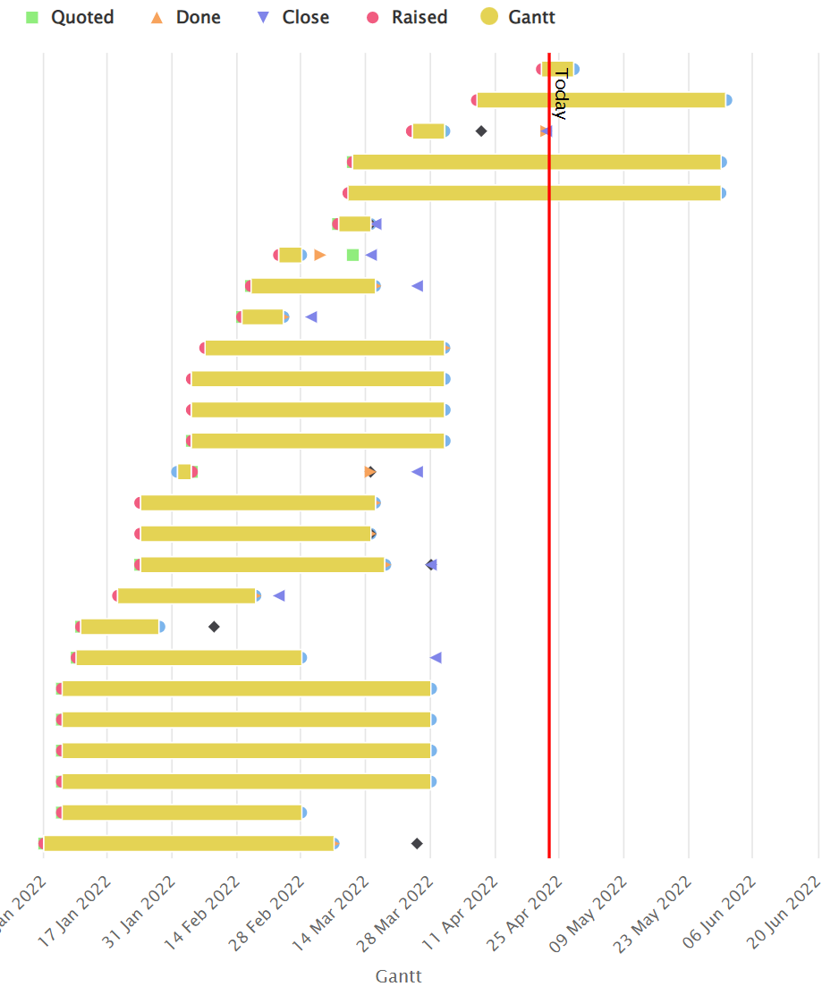
For some chart types, the data series consists of value pairs that contain high-low or start-end values that can be used to visualize ranges or duration. You use the Chart Range window to specify the two columns that contain each value pair.
The chart below uses start and end values to visualize duration.
In the wrap, the start date for each activity is provided in one column and the end date in another. The Chart Range window in the MyWraps toolbar is used to define the two columns that designate each such range to be used in the chart.
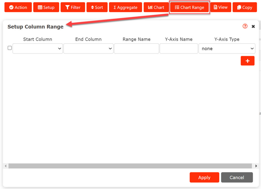
All range-based series you define on the Chart range page are added to the chart defined by the Chart setup page.